
.png)
Industries (Hana Komiyama)
Fashion Health – Strategies for communicating
Using Neon Lights
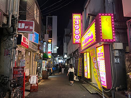
As is explained in the top page of fashion health, the locations of fashion health are mostly in narrow street so that it is sometimes difficult to find. Yet, since Kabuki-cho is famous for the “city of nights”, how they give impression and communicate with the audiences are significant. Thus, many fashion health seemed to be introducing neon lights to their signboards.
As Davis (2017) mentions that
The significance of neon in the gentrified red-light district is visible not only in the disassociation of the light from the sex industry but also in similar communities where neon is targeted for removal because of neon’s association to sex work,
it is obvious that there is strong relationship between neon lights and sex industries. Although Davis (2017) further mentioned that sex businesses are currently using fewer neon lights in order to protect privacy, it is still true that many neon lights are used for fashion health signboards.
Since the neon lights also give a strong impact on the audience even though it is dark, thus it is a successful material for use on signboards of the sex industry, which is located in the narrow street where it is difficult for people to find a business from a far location. As well as the signboards above, the signboard of Petit Doll has he neon light around the signboard that has the store name and price. Thus, although the store is in a narrow street, the signboard gives a great impact even standing far from the signage.
Neon light signage of “11 channel” in Kabuki-cho


Neon light signage of “American Christal” in Kabuki-cho
Fonts
The font also matters in how the health communicates with the customers about the concept and the vibes of the store.
The first picture is the signboard that has the logo of the fashion health, “Petit Doll”. This signage uses the pop font for the name of the store. According to the research, this pop font is frequently used when the message wants to express friendliness and joyfulness ( Ishihara & Kumasaka, 2002). As well as “Petit Doll”, “Strawberry Jam” is communicating with the customers using the pop font in order to appeal the friendliness. People, thus, feel comfortable by looking at the store name in pop fonts. Also, by looking at the font of the name of the store, it enables the audience to understand the concept of the store from the signboards.
Picture of “Petit Doll” signboards looking from the side ways with narrow and dark road.

Signboards of “Strawberry Jam” in Kabuki-cho

Signboards of “Petit Doll” in Kabuki-cho
Specific Themes
Some signboards of fashion health (mainly image clubs) are appealing their specific themes or concepts on their signboards. For instance, the signage of the image club, “Cherry”, has the term 天然系美少女コスプレパブ, which refers to the naturally beautiful girls’ cosplay pub, and there are images of girls wearing the Japanese traditional school uniform, se-ra-fuku (セーラー服) in the back. In addition, the phrase “sexual harassment spa”, is also written above the name of the store. From these three contents, the audiences are able to understand the theme of the business that it is a sexy cabaret club where people can enjoy “sexual harassment” and play with beautiful girls wearing school uniforms.

Signboard of “Cherry” in Kabuki-cho
Language Use
Foreign Languages
Since Kabuki-cho has many tourists, some fashion healths were targeting the foreigners as well by using the foreign languages on their signboards. In fact, the signboards of Nozokibeya Madonna used five languages in total including Japanese. Specifically, the phrase “peeping show” was written in Japanese, English, Chinese, Korean and Thai language.
Uchi and Soto
Goekler(2010) explains about the uchi and soto relationships in languages as follows:

The speech level and style one uses is dependent on numerous factors, including in-group or out-group status, social class ranking (which may be determined by a person’s family structure), social status (based on wealth and age), skill-set, etc. Since language use is a major determiner of how relationships are viewed, formed, and maintained, speakers need to be aware of language mechanisms that determine uchi and soto relationships.
In the signboards of fashion health, the way they try to communicate with the customers showed some uchi and soto relationship.
As it is stated that uchi and soto relationship also reflects the social status and hierarchies, most of the language use in the signboards of fashion health maintains the uchi and soto relationship since they probably consider the customers as people in higer hierarchy. However, the way they make uchi and soto reflected the destination with the customers who they want to communicate. For instance, the signboards on the right have the term いらっしゃいませ , which means welcome to our shop. Although this reflects the uchi and soto relationship between the workers and the customers, the welcoming nuance of the term shows the close relationship between the customers and the workers.
While the signboards of fashion health mostly communicated with the audience by maintaining the uchi and soto relationships, these signboards communicate differently to the girls who are looking for work had the uchi and soto relationship. That is, this signboard has the phrase “わたしたちと一緒に働きませんか?”( Would you work with us?). Since 一緒にmeans together, they are trying to involve the audiences as uchi. Thus, in this case, they do not maintain the relationship between uchi and soto.

