
.png)
Public Signage (Hayato Okazoe)
VISUAL ASPECTS (BESIDES TEXT)
This page will discuss the utilization of visual aspects on public signboards
Public signboards: Signboards which are issued by public organizations (e.g., government, district bodies…) that are not utilized for business / economic profit intentions
Introduction
Signboards that receive no attention would be the equivalent of it just being an useless board. Peter Harnik states in his article, You Have My Word on It: Signage in City Parks, that useless and annoying signs can make the area cluttered, alienating, or even counter-productively infuriating. On the other hand, he also states how greats signs can lift spirits, educate users, build solidarity, and be downright entertaining. Visual aspects should be significant in judging whether a signboard is useful or not, as they are crucial in attracting viewer attention. This page will examine such various aspects and how they appeal to viewer attention.
Coloring
Coloring is a crucial element which cannot be ignored when discussing public signboards. This is because coloring is highly influential in altering viewer impression. For instance, if you take a look at the signs around you, you may realize that the EXIT signs are in green, WARNING signs to be in yellow, and so forth. The color schemes for each signs have its’ respective purposes, and public signboards observed in Kabuki-cho are no exception.
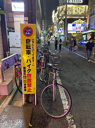
Warnings (yellow, red)
For instance, the signboards shown in the three images above share the identical color scheme of yellow and red. The yellow color has an effect of conveying a sense of danger to the viewers. According to the Safety Sign Supplies, one theory of this explanation, is its’ associations with the nature world. Bees and wasps are yellow colored, in order to signify how dangerous they are, and to warn predators to stay away from them. Likewise, humans also take this color as a warning unconsciously. Similarly, the red color also has a similar effect. Studies of color sciences claim how the color red is the most visible color from distance. The wave length enables the color to penetrate through fog, dust, and clouds, which allows viewers to able to see it even in a rainy, misty day. For such reasons, red is often utilized in road signs where drivers can be aware of hazards ahead of time. Regardless of the differences in content between the three, the common intention is to warn the viewers. Therefore, such color scheme utilizations are fair and comprehensive to be used for these signboards.
Signboard - bicycle parking
Signboard - bicycle parking


Signboard - kyakuhiki
No Littering —> Cleanliness (green)
The color green was often utilized in public signboards correlated with littering. The signboards shown in the two images above are both signboards which call for the public to refrain from littering in the district. Studies of color sciences show that the color green represents safety and peace, which is associated with plant life. Therefore, green is used many exit signs and first-aid kids, because it symbolizes life (—> safety). Likewise, green is estimated to be used in such signboards above, in order to indicate the “safety” of Kabuki-cho without any trash and garbage being thrown in the streets. Moreover, as green is often associated with plant life, such color utilizations in these signboards can also emphasize the sense of “cleanliness” of the district as well.

Signboard - No Littering
Signboard - No Littering
Landmarks (Pattern 1) (red)
Public signboards that function as landmarks also had a common pattern in terms of color scheme. The signages shown in the two images above are the Ichiban-gai signage gate and the I Love Kabuki-cho signage; two of the most prominent landmarks of Kabuki-cho. Interestingly, both of these signages use the color red as their main color scheme. Mentioned earlier, the color red symbolizes the sense of warning to the viewers. Besides, it also has an effect of making one to feel passionate and energized (Gremillion, 2019). Considering the district to be the home of various entertainment, such emotional influence on viewers would be welcomed. Therefore, such color utilization is well comprehensive to be applied to landmarks of the district.
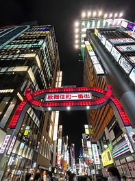
Ichiban-gai signage gate
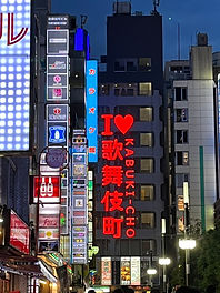
I Love Kabuki-cho signage
Landmarks 2 (Pattern 2) (colorful)
Some signages in the district did not seem to have a templated color scheme. The signages shown in the two images above are the Sakura-dori signage gate and the Godzilla road signage. Interestingly, the two signages did not have a set of fixed colors but rather had a colorful scheme; constantly changing its’ colors as time passes by. In the image, the two signages are colored in blue, however, if you take a look at the actual signage, one can easily notice that they constantly change to various colors. However, because the signage changes into various colors through time, this does not mean that all the theories of color science apply to the meaning. Instead, such unique color scheme appeals to the construction of the flashy cityscape which Kabuki-cho is prominent to be known of. While these signages do not hold a particular meaning alone in terms of its’ color scheme, it contributes in creating meaning by being perceived as a single scene of the cityscape.

Sakura-dori signage gate
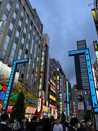
Godzilla road (Chuo-dori) signage
Image use
Image use is also significant in grabbing attention from the viewers. Annie W. Y. Ng, Kin Was Michael Siu, and Chetwyn C. H. Chan argues in their article, Exploring User Preferences on Public Sign Design with a New Practice: The Stereotype Production Method, how one or two essential pictorial elements are preferred in simple sign designs. Moreover, they also claim that viewer’s cultural values were shown to take an influential role in the design of signboards. Taking such statements into consideration, public signboards observed in the district had various sorts of images incorporated into their visual aspects, in order to effectively grab viewer’s attention.
Kabuki
One interesting pictorial element observed in the signboards were the “kabuki actors”. The signboards shown in the two images above are examples of the kabuki actor images incorporated into its’ visual aspects. While the signboard on the left pasted the eyes of a kabuki actor as a sense of “monitoring”, the signboard on the left illustrated a kabuki actor smoking a cigarette. As the name of the district is “Kabuki-cho”, utilizing kabuki actors as a pictorial element would bring familiarity to the viewers. Moreover, kabuki actors and kabuki drama is considered as one of the most prominent Japanese traditional cultures, which reflects the cultural values of Japan mentioned earlier. Considering its’ high popularity both within and out Japan, such utilizations as pictorial elements in unique illustrations are likely to be intended to catch the attention from the viewers.
Signboard - Bicycle parking
Signboard (flag) - No smoking

Prohibition signs
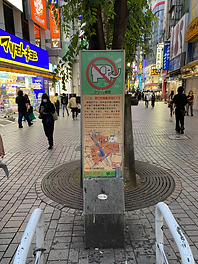
This aspect may be the most familiar, but utilizations of the ‘prohibition sign’ (sign of a red circle with a slash in the middle) were also frequently seen in the district. The common (but obvious) aspect between the signboards using this image, is that they limit (prohibit) the viewers from doing a certain action. For instance, all three signboards shown in the images above prohibit the public from parking (their bicycles) around that certain area. Such images are also commonly utilized in the Road Traffic Law, which enables viewers to instantly understand the content at first sight. Therefore, utilizations of such images into these signboards would attract viewer attention, as well as initially enable viewers to understand what the signboard is about.
Signboard - Bicycle parking

Signboard - Parking

Size / Shape
Signboard - Bicycle Parking
Sizing also varied when we compared the public signboards observed in the district. Some signboards were as small as an A4-sized paper (almost like a poster), while others were as big as a public billboard. Sizing is also a significant feature in terms of grabbing viewer attention. Signboards with large sizes would obviously have a greater chance of grasping attention compared to those with small sizes.
Small
Some signboards were approximately the size of an A4-sized paper, as shown in the two images above. Unless the viewer has good eye-sight, it is hard to comprehend what is written on the signboards, without coming close up.
Middle
Some signboards were approximately the height of an adult male, as shown in the two images above. However, the text size differs between the two. While the text of the signboard on the left is large enough for viewers to be able to read without coming close, the text of the signboard on the right is relatively small. However, the amount of text is also abundant which makes the signboard highly informative. This comparison between the two can explain how the size of signboards are not necessarily in proportion to its’ comprehensiveness.
Large
Some signboards were enormous in size; approximately twice the height of an adult male, which are shown in the two images above. The size of the signboard itself, as well as the texts are big enough for viewers to be able to comprehend the content from far away (image on the right). Likewise, they were instantly noticeable compared to the signboards with smaller sizes.


Image A
Image B


Signboard - littering
Signboard - kyakuhiki

Signboard - no parking
Signboard - no parking
Conclusion
This page examined the various visual aspects of the public signboard in the district, and how they were intended to influence viewer impression. Although each and every aspect seemed to be effective individually, such would not be necessarily assessed on its’ own. As Byungsuk Kim and Jina Park discussed in their article, The Visual Effect of Signboards on the Vitality of the Streetscapes Using Eye-Tracking, the physical elements that construct the cityscape are processed as a single scene, rather than individually. Therefore, signboards are also likely to be perceived as a group as well. Portella discusses in her article, Visual Pollution about the relationship between signboards and public recognition. She notes how an excessive number of signboards and synonymous visual features can lead to visual overload of the viewers.
Conflict between design of commercial signs and aesthetic composition of building facades, and (ii) visual overload provoked by excessive numbers of commercial signs, plus high variation of their physical characteristics such as size, proportion, colour, material and so on. (Portella, 2014)
Moreover, she emphasizes how an excessive number of signboards can lead to giving a negative impression by viewers.
Disordered public spaces are evaluated negatively because observers are exposed to a series of disconnected aesthetic elements (such as commercial signs, buildings and urban furniture) which provoke user saturation.(Portella, 2014)
Taking Kabuki-cho’s immense number of public signboards placed in the area, viewer impression may not necessarily fall on the bright side.